

Blazor Helpers Server App: .NET 6 and Telerik V3 Controls Upgrades
blazor blazor entity-framework csharp blazor-server telerik
As per the previous post, a Blazor Server app was upgraded to .NET 6 from 6). Telerik Blazor controls were also upgraded to version 3 for 2. This post discuss the upgrades.
.NET 5 to 6 Upgrade
The app was upgraded from .NET 5 to .NET as .NET 6 is LTS; Long Term Support..Net 5 reached end of life this May and is out of support as per here. In upgrading to .NET 6, I first had to change to Visual Studio 2022 from 2019, a requirement for .NET 6. Once loaded there, the .NET version can be changed but the app probably will fail to build. I needed to do some NuGet updates. I also needed to update Entity Framework packages via NuGet to version 6. Various Microsoft.Extensions packages were also upgraded to versions 6 via NuGet.
Telerik Upgrade to Release 3
Blazor comes with a set of of-the-shelf controls. Originally, you got more functionality by using third party controls such as provided by Syncfusion, Radzen and Telerik. I haven’t used the first two but the Helpers app was built using the Telerik controls. Going forwards I have continued, via upgrade, with Telerik controls. With this, you do an installation, enable Visual Studio to optionally source NugGet packages from Telerik and then you can add Telerik Blazor to a Blazor project.
In the project file:
<PackageReference Include="Telerik.UI.for.Blazor" Version="3.4.0" />
On a razor page:
@using Telerik.Blazor.Components
And if required:
@using Telerik.Blazor.Data
There is also some under the hood setup for the project in Layout. There are many demos with actual working examples with code at Blazor Components Demos and Examples. See First Steps with Server-Side Blazor for getting setup. For a Wasm app see Wasm Getting-started.
When implementing the app’s new functionality, it was desired to add some functionality with the Telerik components which I couldn’t see how to implement. On posting a number of queries on their forum, I got some quick replies from Telerik that these are now available, but I needed to a new license to upgrade form version to version 3; which I now have. The Version 3 Telerik Blazor changes are listed here. One of the main changes was the ability to use CSS classes within the TelerikForm and the TelerikGrid. One road block was with the TelerikButtons component. The Primary/Secondary property needed replacement by a ThemeColor property. This required a bulk replacement. There is also an issue with the TelerikCombobox.
Updating Buttons
<TelerikButton @onclick="ToggleNavMenu" ButtonType="@ButtonType.Primary">Show/Hide Add AVSLRound<TelerikButton>
becomes
<TelerikButton @onclick="ToggleNavMenu" ThemeColor="@ThemeConstants.Button.ThemeColor.Primary">Show/Hide Add AVSLRound<TelerikButton>
Updating ComboBoxes
In upgrading to .NET6 and Telerik 3.40 (from2.x), a TelerikComboBox may cause the following error message:
...does not have a property matching the name 'PopupHeight'
<TelerikComboBox Data="@Groups"
    ...
    ...
    @bind-Value="selectedGroupId"
    PopupHeight="150">
</TelerikComboBox>
becomes
<TelerikComboBox Data="@Groups"
    ...
    ...
    @bind-Value="selectedGroupId">
    <ComboBoxSettings>
        <ComboBoxPopupSettings Height="150" />
    </ComboBoxSettings>
</TelerikComboBox>
New Telerik Features
Many of the new features are facilitated by the ability to use CSS style classes within controls such a Forms and Grids.
One such example is the ability to format section headings in a Form.
You can define a CSS class for it as follows:
<style>
.my-form-group-class {
    color: purple;
    font-style: normal;
    font-weight: bold;
    font-size: medium;
}
.my-form-group-class legend {
    color: red;
    background-color: lightgreen;
    font-style: italic;
    font-weight: bold;
    font-size: larger;
}
</style>
The legend is used by the group header and the other section is used by each FormItem in the Form as follows:
<FormItems>
    <FormGroup LabelText="Athlete and submitter details"
        Class="my-form-group-class"
        Columns="1"
        ColumnSpacing="15px">
        <FormItem Field="@nameof(NewRecordClaim.First_Name)"><FormItem>
        <FormItem Field="@nameof(NewRecordClaim.Last_Name)"><FormItem>
    </FormGroup>
    ...
    ...
</FormItems>
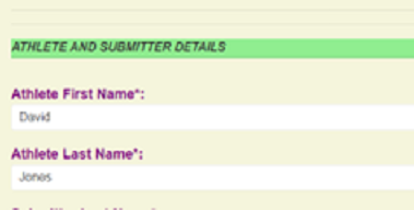
The outcome on the rendered razor page.
The only issue was getting the red font to render as red colour..
Removing TelerikGrid Scrollbars
On the page to be printed it was also desirable to hide scroll bars. This was done as follows:
The CSS style:
<style>
.grid-no-scroll .k-grid-content {
    overflow-y: auto;
}
.grid-no-scroll .k-grid-header,
.grid-no-scroll .k-grid-footer {
    padding-right: 0;
}
.grid-no-scroll .k-grid-header-wrap,
.grid-no-scroll .k-grid-footer-wrap {
    border-right-width: 0;
}
.grid-no-scroll .k-cell-inner > .k-link {
    justify-content: center;
}
</style>
And the razor code:
<TelerikGrid Data="@records"
    Class="grid-no-scroll"
    Pageable="false" Sortable="false" Groupable="false"
    FilterMode="Telerik.Blazor.GridFilterMode.None"
    Resizable="false" Reorderable="false">
    ...
TelerikGrid alternate row background and Highlighted cells.
The Grid background for the printable page required formatting for the header, rows and highlight cells. The rows are to alternate colours and a cell is highlighted if a record is recent. The implementation here involved getting access to the data context specific to the grid row (args.Item) and specific cell (args.Value) in the code behind. This is implemented with the following CSS classes:
<style>
.highlightCellBackGround {
    background-color: lightyellow;
}
.rowBackground {
    background-color: \#fae4e4;
}
.rowBackgroundAlt {
    background-color: lightgray;
}
.k-grid th.k-header {
    background-color: red;
    color: white;
    font-weight:bold;
    text-align:center;
}
<style>
And the following razor code:
<GridColumn Field="@(nameof(History.Open))" Title="Open"
    Width="150px"
    OnCellRender="@OnCellRenderHandler">
    <Template>
        @( new MarkupString((context as History).Open) )
    <Template>
</GridColumn>
And the code behind:
void OnCellRenderHandler(GridCellRenderEventArgs args)
{
    History row = args.Item as History; // The complete row data
    string item = args.Value as string; // The cell data
    if (item != null)
    {
        string[] items = item.Split(' ', StringSplitOptions.RemoveEmptyEntries);
        if (items.Length > 3)
        {
            if ((items[2] == "2022") || (items[2] == "2021"))
                args.Class = "highlightCellBackGround";
        else
        {
            if (row.Id % 2 == 0)
                args.Class = "rowBackground";
            else
                args.Class = "rowBackgroundAlt";
        }
        }
        else
        {
            if (row.Id % 2 == 0)
                args.Class = "rowBackground";
            else
                args.Class = "rowBackgroundAlt";
        }
    }
}
Each History item has an Id used to assign the alternate background.
The item structure is as a space separated string:
- Name
- Result
- Year
- Note
If the record is recent then the highlight background is used in preference. The second else part is for blank entries.
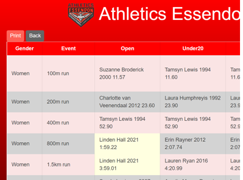
A printable page, nicely formatted.
Linden’s records are recent and therefore highlighted.
Optionally hiding Cell content
On the page showing current records in a TelerikGrid there is a button for initiating making a record claim for each row. Whilst there are also checks that the person submitting the claim is able to so do on the target page, the claim button for each record is also only enabled if the logged in member is a member of the required age group etc. A better option though is to hide such buttons if they are not allowed to make the specific claim. Whilst visibility is simple to implement in razor UI code with a Boolean expression bracketed Ui section, within a grid this could be done for a cell’s content. An example of cell specific qualification for the Claim button is:
<GridColumn Field="\@(nameof(RecordResult.Status))" Title="Status" Width="80px" />
<GridColumn Field="\@(nameof(RecordResult.Status))" Title="Claim" Width="80px"/>
    <Template>
    @if (memberx != null)
    {
        var recordResult = context as RecordResult;
        if ((recordResult.Status == recordStatus.current)
        && (memberx.CanClaimAgeGroup(recordResult.AgeGroup)))
        {
            <TelerikButton Icon**="Information"
                ThemeColor="@ThemeConstants.Button.ThemeColor.Primary"
                @onclick="() => MyCustomCommandHandler(recordResult)">
                Claim
            </TelerikButton>
        }
    }
    </Template>
</GridColumn>
So a record can only be claimed against if the record is current and the member satisfies:
- If a member of Coaches, Team Leaders or is Admin – OK
- If not , then they must fit the age for the record (Is in the age group or is younger. A Masters athlete can claim an Open record.)
Conditional Form Content
When submitting details for a record claim, the performance could be a time, distance/height or points. Initially that part of the form was implemented such that eacj part was only enabled depending upon the context. The disabled entry UIs still showed. Later, the disabled entry UIs where hidden. The conditional bracket needed to bracket the whole FormItem:
@if (IsDistanceMeasured)
{
    <FormItem>
        <Template>
        <label for="DistanceVal">Distance/Height (Field Event):</label>
            <div class="k-form-field-wrap">
            <TelerikNumericTextBox @bind-Value="@MyModel.DistanceVal"
            Decimals="2"
            Id="DistanceVal"
            T="decimal"
            Format="\#0.00"
            Max="100"
            Min="1"
            Enabled=IsDistanceMeasured
            Width="100px" />
            </div>
        </Template>
    </FormItem>
}
else if (IsPointsMeasured)
{ … etc …
Conclusion
Going forwards there was a need to upgrade the Blazor Server app to .NET 6 and the Telerik Blazor controls to release 340. Various NuGet packages needed to be upgraded including the Entity Framework (to Ef 6). The upgrade to .NET 6 was required as .NET 5 is no longer supported. Telerik Release 3 enables the extensive use of page specific CSS classes in formating of Telerik Grids and Forms.
| Topic | Subtopic | |
| This Category Links | ||
| Category: | Blazor Index: | Blazor |
| Next: > | Blazor Helpers Server App | Reverse Reverse Engineering with Entity Framework |
| < Prev: | Blazor Helpers Server App | Version 2 - Club Records |